Review: Liquitex Inks
Joyce Lee is a full-time calligrapher and the creator of Artsynibs, a lifestyle and calligraphy website. She also runs introductory calligraphy workshops in Manchester, which we highly recommend. We asked Joyce to review our new Liquitex inks to put them to the test with pen and brush. 
"When it comes to ink for calligraphy, consistency is one important factor. For some, it’s the watery characteristic of ink they like, while others prefer a more viscous texture for intensity.
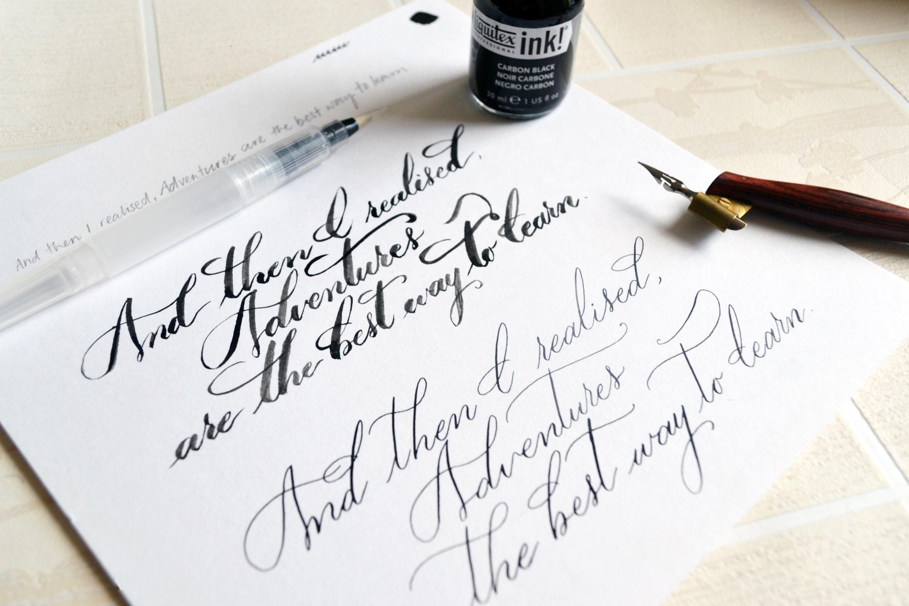
As with the nature of acrylic inks, this Liquitex ink is thicker, making it easy to control especially with a dip pen. I like the coal-like colour of this ink, making my writing look as though it’s printed. 
I then tested this with my brushes and realised that I had to dilute the ink a little with water so the brush wouldn't dry out halfway through an alphabet. Typically with brushes, the writings tend to be larger hence strokes are longer. Running out of ink mid-stroke is not fun.  The Liquitex ink dries fast, perfect for adding any extra touches or flourishing at the end. However, this also means that you’d need to constantly rinse your nib just so that the ink doesn't dry up and coat it. Leave it too long without rinsing, you’ll soon find clumps of dried ink on your nib that’ll be causing your lines to look thicker than usual. This also makes cleaning much tougher – You might need a scrubber to get the ink off.
For what it’s worth, the Liquitex ink also boasts a wonderful range of colours, from Dioxanine Purple to Yellow Orange Azo. If these names don’t pique your curiosity, I don’t know what will! Check them out in-store at Fred Aldous Manchester or Leeds."


Leave a comment